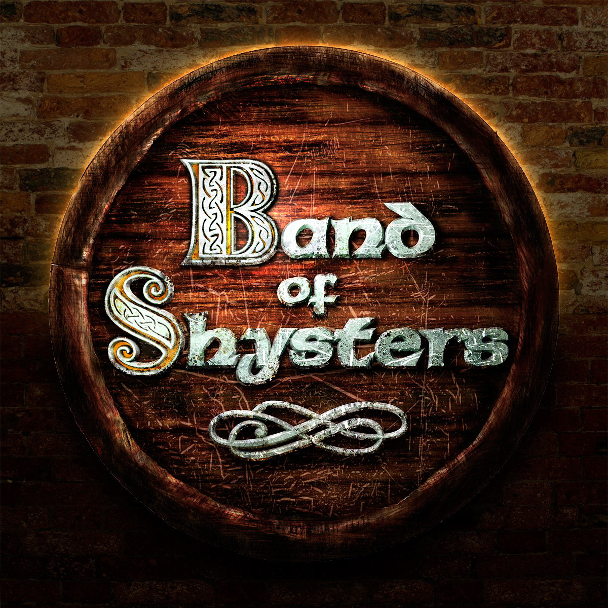
The band logo, initially designed 2007, updated 2010. The top of the barrel is made to resemble a bar floor scratched from vigorous party action. I added the brick background texture here to make it pop a little more since it's not usually displayed on its own.
When starting the design process for the band's upcoming album, we decided that each song on the album should have its own fully illustrated spread in the cover booklet. This piece is an illustration for the song Fields of Athenry (trad.). For these illustrations, I was limited to using source material available for free as well as things I'd photographed myself.

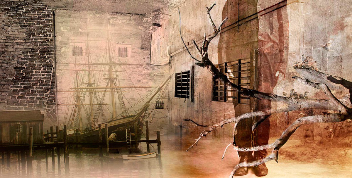
Another illustration from the booklet, this one channels the themes of Paddy's Lament (trad.). Out of all the illustrations (twelve in total) this is probably my favorite, though I'd be hard pressed to tell you why that might be.
I don't have a lot of experience with motion graphics, but I made this thing that – eventually – reveals the Digipak cover for the album. It's a journey through the visual themes of the cover accompanied by a live recording from one of the band's gigs (slightly better than bootleg quality audio).
In addition to the things displayed on this page I designed (and initially constructed) the band's website. Please note the site was designed in 2010 so it really predates the current era of mobile-friendliness in web design and may even assume users have Flash installed (as over 95% of users did at the time). Although I'm still quite happy with it, I can also see how much I've progressed over the years as a web-designer.