
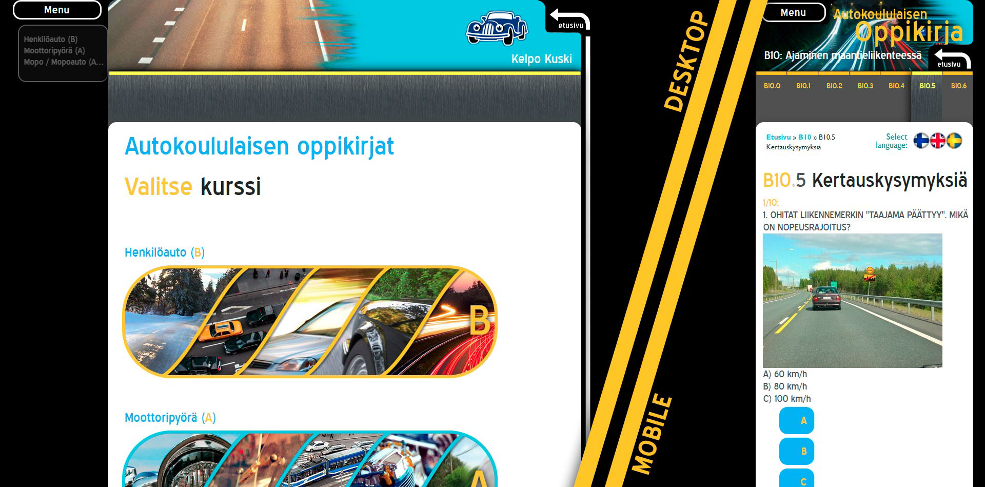
These are screencaps showing both the desktop and mobile versions of the site as they appeared back in 2013. At that time, responsive mobile-first web-design wasn't something you take for granted. Neither had the standard design ideas for it formed yet, so people weren't as used to certain things being in certain places on the sites they visited, not as much as they are nowadays.
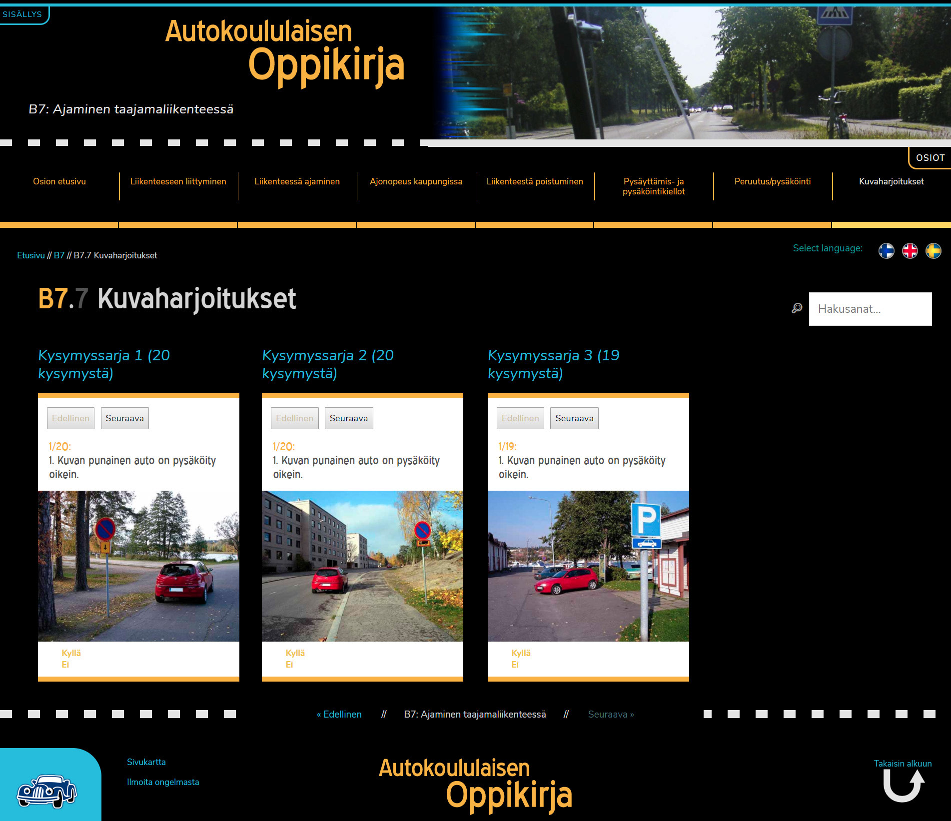
The site is currently being redone behind the scenes. Once it's done, it'll look something like this. And be "being redone" I actually mean I'm the one redoing it. With the new design I went for something cleaner, sligtly more simplified and now taking into account more of the trends people are used to seeing in their nice, mobile-friendly websites.
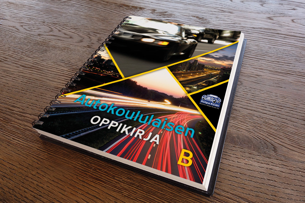
I was also tasked with the design & layout for the printed version of the site (which is a textbook for student drivers in Finland). This is a mockup showing the front cover.
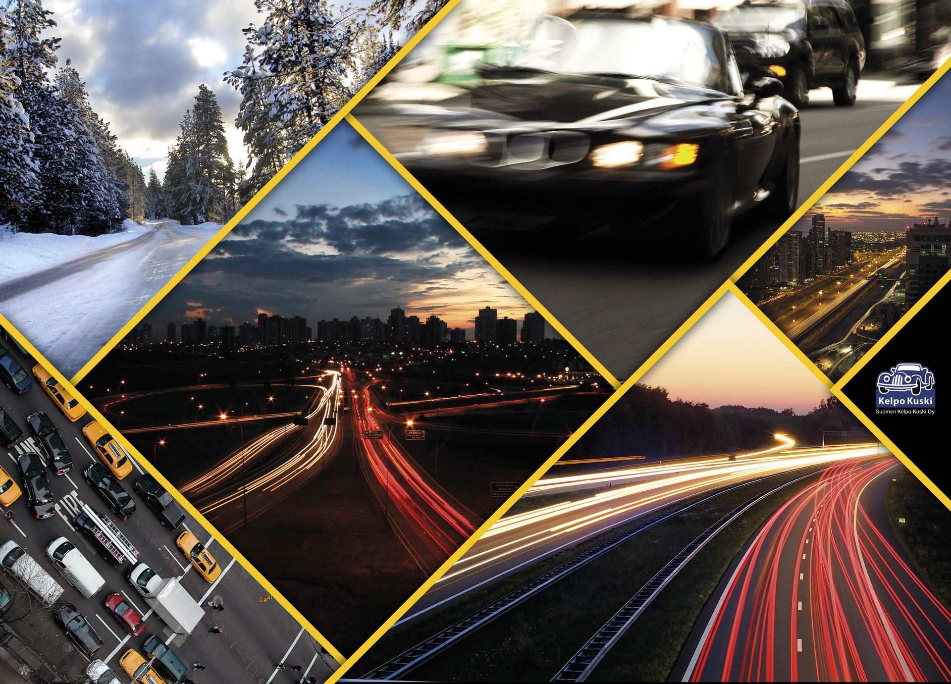
The front and back covers for the print version, displayed here w/out the text layout.